Review: Berlin: City of Stones, and Berlin: City of Smoke, by Jason Lutes
Berlin: City of Stones and Berlin: City of Smoke are the first two of a series of graphic novels by Jason Lutes, depicting the city at the end of the Weimar republic.
I've started a ramble on graphic novels before, and this is a fine excuse to elaborate. I am not the best ambassador for the form. I don't read a whole lot of them, and my tastes reflect a strong imprinting on silver age styles, that happened between 1978 and 1989 maybe, starting at the point I could ever convince Mom to buy me one off the carousel and ending when I outgrew too many of the dramatic elements and finally got sufficiently disgusted with the constant disregard for Our Story So Far. The art of that era was undoubtedly marketed to teenage boys, and it came with hyperkinetic action, exaggerated perspectives, and a human form (male and female) idealized to the point of eroticism--the artistic equivalent of overacting--but there was some fabulous drawing going on, and anything I've leafed since has been sorry (certainly it hasn't been pale) in the comparison. I realize I'm biased, but I think I was lucky to catch the artistic peak, not just for the highly-detailed lines that the era favored, but I also think digital colorization turned everything to shit.
I read up: in those earlier days, artist hand-colored proofs according to an industry palate, and further indicated shading and tone for the benefit of the printers: the color plates were made up by these specifications. (Previously, I thought that colored proofs were photographed through filtered cameras to generate the plates--maybe this was done too?). Details of shading were no doubt lost, but I think that hand coloring kept the artists close to the detail work, and, I think, gave us a great deal of black-ink shading to compensate for the paucity of available colors. You know, art benefiting from constraints and all. Over the years (and at the time I was reading the things), an expanded palate emerged, and eventually (around the time I stopped), it went digital, producing as unlimited a choice as you can generate with your favorite computerized painting tool. Personally, I think old medium produced much better art than the solid photoshopped fills they use today, now paint-bucketing the careful lines with virulent computer-provided patches of monochrome. I can't look at the things these days--they're garish, and while I like to think that there's good storytelling to be developed in that medium, it's mostly the art that keeps me away.
In the small handful of "serious" graphic novels I've read since I turned 17, and most of the newspaper strips, the drawing itself appears to be less important than the art layout. How do the frames and the objects in them relate to tell the story, move along a conversation, create a kinetic sequence, whereas the drawings themselves are expected to be sylized according to the medium, about only as much as to be identifiable. And the emphasis on well organized frames is important, but I need some minimum drawing ability for my appreciation. I know it's been noted the cartoons too: I remember Bill Watterson complaining in the introduction to one of his Calvin and Hobbes anthologies about the general low quality of drawing in his medium (which he since recanted, I believe), and he had something of a point, and made up for it in some of his strips, which is no small part of why I loved 'em. (Now there was a guy who knew how to quit when he was ahead.) My tattered pile of old MADs sort of spanned the spectrum between raw art and layout.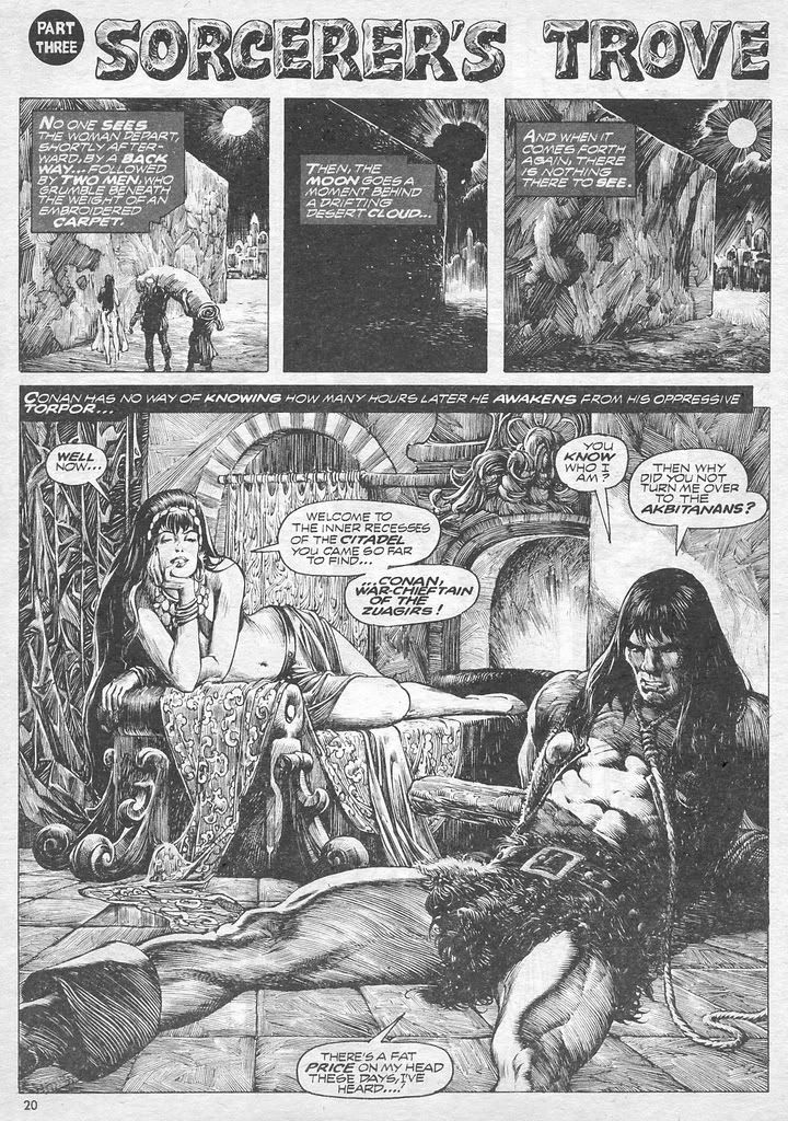 It's a long segue, but a lot of my reaction to things like Berlin ends up closely related to how I look at them. I spent some time in the above contexts trying to pinpoint Lutes' syle. The drawing is decent, passing the art bar, and including nice scenery shots, and I think is improved by avoiding color in the first place. It's a far cry from the tradition of the gory and lascivious detail you'd get in an old black and white Savage Sword of Conan, and if it did make use of all kinds of city views, the creative layouts are rarely rolled into large complicated images, and the scene changes are more in the lines of storytelling transitions than tricky artistic ones. When he does go there--I'm remembering the way he worked in art-school technique in one series of panes about a lecture, and how in a different series, he brought some full-bacchanal scenery in his glimpses of underground nightlife, and there were a couple intrusive uses of white space--it instantly becomes more interesting. Given the clever vehicle of making one of his characters sketch compulsively, you kind of wish he worked that conceit into his own art more. I will say that I enjoyed the way Lutes moves between a character's dreams and reality as a means to shift the point of view from the dreamer to the dreamed-of, and he does a nice job of employing the comics-equivalent of a roving camera to lead us between plot arcs too, but these aren't things that are contained in the drawing.
The usual dialogue balloons, thought balloons, and text boxes seem more ingrained to the medium to the point they're unnoticable. Lutes is big on thoughtful dialogue and faces, not really on any of the raw action and cheesey drama of the superhero tradition. He lets the characters' expressions reveal emotions most of the time, but still not in a way that feels very new. There's something familiar about doing it that way: it frequently reminded me of an old Lighter Side strip, where the point is more about writing, that is, more about setting up and delivering a piece of dialogue. The ways Lutes' conversations get spaced-out in a series of panels, the way that situations are introduced with people-free panes, and the use of facial shots with minimal background drawing, it all lends a strange quiet feeling to the book, and when Lutes falls back on comics tropes like punctuation marks over people's heads, big-graphic sound effects, and swirl lines, it feels like he's regressing. The quiet space does seem appropriate to convey the impending political fate that we know is coming for all of these characters.
Berlin did what I wanted it to do, what Sinclair Lewis failed to do, which was to set up a feeling of how it happened there. I'm falling back too much on my history-for-engineers classes here, but as I remember learning it, the usual story of the fall of the republic and the rise of fascism is told as a series of calculated political moves and power grabs by you-know-who, against a backdrop of economic depression. The classroom version sort of leaves out the city as a hub of European culture, the hopeful liberalism of the Weimar Republic, the personal wounds of the Great War, the vibrancy of urban life, and Lutes gets a good chunk of that in his comic, as well as the sense of how it is beginning to untie. Here in America, we also tend to leave out the Communist influence in prewar Germany and the National Socialist's definitional opposition to it. Lutes doesn't give up much love for the actual Reds--they're given to rallies and thuggery too--but he expends a great deal of sympathy toward those characters attracted to the philosophy, and none towards those inclined toward authoritarian Nazism. (Curiously, he has yet to draw a swastika--flags are represented with a big blank space devoid of party emblem.) A great deal of dialogue is devoted to the spectrum of characters' resistance to the growing popular ideas, and to their bonds of class, at a time, in the story so far, when they still feel free to express these things.
Berlin is advertised as a graphic novel with as much texture and depth as a regular novel. I contend that it makes good use of the comic form (with the caveats noted above) to tell the same kind of story, but if this is novel-like, then it's wicked thin. I think I knocked off each of the volumes in about an hour, less time than it's taken me to write about them, and I am not a fast reader. The art is reasonably well-done, but it's not so engaging as to make the eye linger. I think the bigger problem is that we have an ensemble cast in which none of the characters have enough pages under their belt to be especially memorable. This many people in a 150-page prose novel would be just as difficult to develop. It's worse that Marthe Muller, the closest thing we have to a protagonist, is devoid of much defining personality. She's a little introspective, and a little independent-minded, has a ghost or two, but her spontaneity, devotion, and likeability don't really seem to come from anything we can see her say or do. Worse, she's the most generically drawn of all of them (defined with a weariness in her face that marks her as slightly older than the other students, but younger than the workers and newsmen, but that level of detail varies by pane, and sometimes I was reduced to carefully checking noses to make sure I knew who the story was following at the time). The journalist Severing is a little better realized, but a downer, and mostly I wait for his descent into real depression. Marthe's friend and lover, Anna comes off the more sincere, with actual challenges with a modern identity and mixed cues in a straight socity, and the Jewish boy David is given some interesting private life beyond the external story as well. The bigger drama we see is from the folks from the working and poorer classes, but it's also a cheaper sort, more basic stories of violence and sacrifice. A runaway girl, and dead mother, and some unlikely compassion, and finally I'm finding myself engaged.
Berlin takes a look at a transitional place, and recovers the forgotten human and social elements, and I think this is very much its strength. As a comic, it's not deeply innovative, but it uses the medium well in getting this story told. As a novel, it's readable, but I can't bring myself to see it as the great black and white hope, whatever NPR would like us to believe.
![]()
3 comments:
Just poking around out there, and it's obvious that I don't know what the hell I'm talking about. Nothing new there. The heavily inked art style and its creepy body fetish seems to still live just fine, and it's probably not the coloring tech (although it may still help crappy art look worse) so much as a small-sampling bias built from hardly looking at the things in 20 years.
Really, totally clueless. I should delete the damn introduction. (Berlin still looks like an old Dave Berg strip though.)
"Curiously, he has yet to draw a swastika--flags are represented with a big blank space devoid of party emblem."
German law prohibits display of the swastika. Such would mean that the book could not be sold in Germany.
Post a Comment